Science, Virus, and Creative Freedom
Some projects stand apart. Not only because of their subject matter — the fight against HIV — but because of the creative freedom they demand. The brief was unambiguous on one point: “we are looking for something very different from what is your typical Medical Art, and that is why we have chosen you.”
A rare invitation. And a responsibility to match.
The Challenge: Making the Invisible Visible
The mission was to create two illustrations for a pharmaceutical campaign featuring Maraviroc, a CCR5 antagonist — the first oral entry inhibitor against HIV. Unlike other treatments that destroy the virus once it has entered the cell, Maraviroc prevents the virus from entering in the first place. That scientific distinction had to become an image. Powerful, immediate, unforgettable.
Two visuals to produce:
- The attack — HIV particles assaulting a T-cell
- The protection — the T-cell defended by the product, symbolized by the blue ellipse from the Maraviroc logo

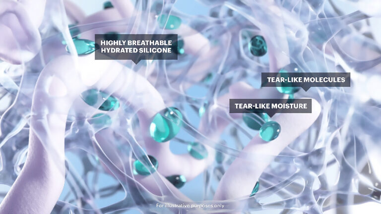
Step 1 — Building the Virus
It all starts with a fundamental question: how do you represent HIV without falling into the trap of cold, clinical microscopy-style rendering?
Two directions are explored. The first — more abstract, more organic — remains a personal favorite: multi-layered glass surfaces, internal refractions, light that seems to pulse from within the viral particle. An aesthetic somewhere between a gemstone and a bioluminescent creature.
Too abstract for the client? Perhaps. But this exploration is not a detour — it is the creative engine that will fuel everything that follows.
The second version retains this foundation of glassy surfaces with multi-layered interiors, while incorporating more recognizable elements: the characteristic spikes of the HIV virus, its identifiable spherical structure. The virus becomes both scientifically credible and visually compelling.
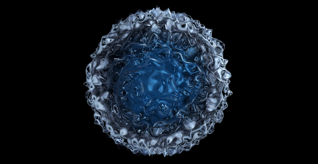
Step 2 — Sculpting the T-Cell
The T-cell is the other protagonist. Here too, the creative choice is radical: rather than a realistic textured surface drawn from electron microscopy references, the cell is treated as a liquid, organic sculpture.
Its surface is a turbulent landscape — molten metal, fractured crystal, living skin. The deep blue of its nucleus contrasts with the silver reflections of its membrane. It is massive, imposing, almost architectural.
Deliberately more abstract than the references provided. But it is precisely this assumed distance from realism that gives the image its visual power.

Step 3 — The First Illustration: The Attack
The infected T-cell changes in nature. Its surface, once silver and cold, shifts to gold and warmth — the color of infection spreading. The viral particles, orange and luminous, swarm across its membrane and scatter into space like a wave.
The lighting work is central: the warm-to-cold gradient tells the story of the shift between healthy and infected states without a single word. The icy blue background amplifies the drama of the scene.

Step 4 — The Second Illustration: The Protection
This is the most complex image — and the most narrative.
The T-cell here reclaims its cold, bluish, healthy surface. And surrounding it: a translucent blue ellipse, drawn directly from the product’s logo, deflecting the virus from its trajectory. The golden, luminous viral particle ricochets off this invisible shield.
Maraviroc’s mechanism of action — blocking the virus before it ever reaches the cell — is captured in a single image, without text, without diagrams. Just geometry, light, and motion.
What This Project Says About Medical Illustration
Scientific illustration does not have to choose between accuracy and beauty. The most powerful medical images are those that make you understand and feel — that transform a molecular mechanism into something the eye and mind can grasp in a single glance.
This is what I look for in every project of this kind: the precise point where science and visual language converge to produce an image that looks like nothing else.
Client : Pfitzer