
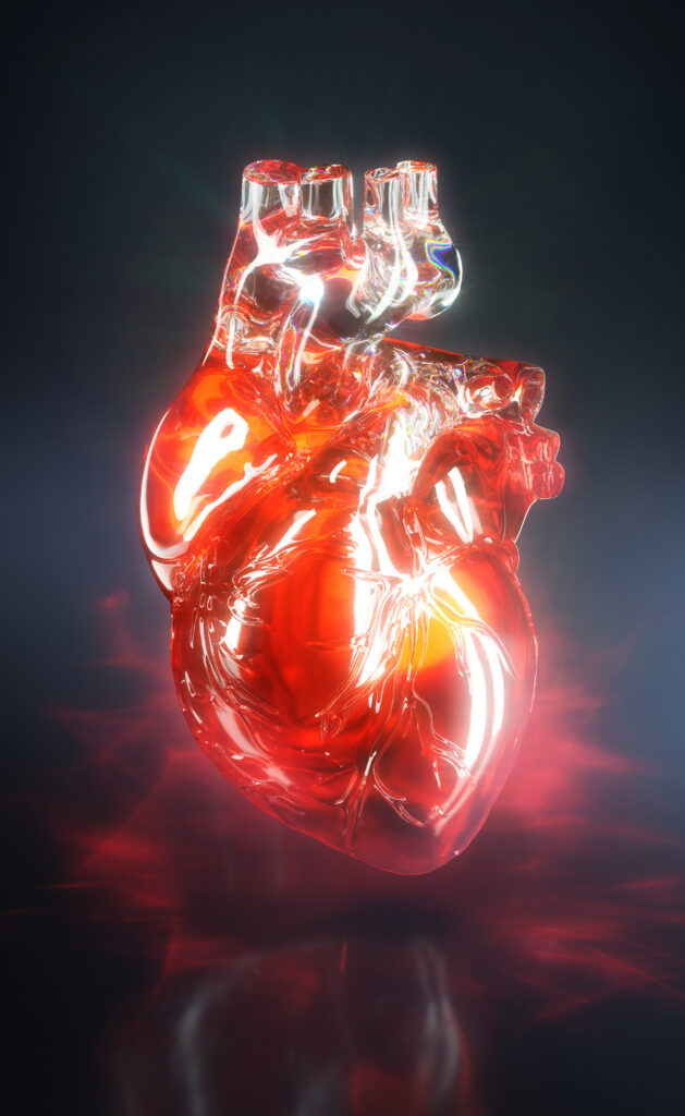
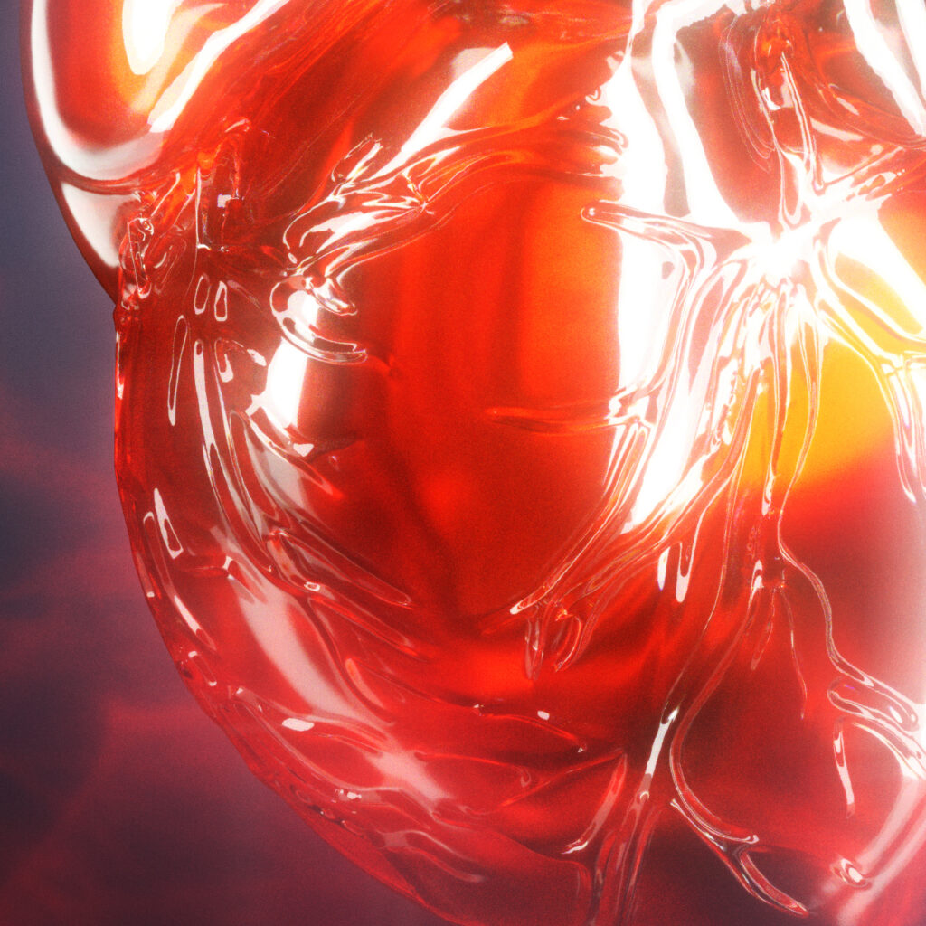
A beautiful heart, not a gory one. Made of glass. Red. Floating. That was essentially the brief received from Alla Dreyvitser, Visual Presentation Director at the Washington Post, for an exceptional commission: the cover of the special Health & Science section, dedicated to heart disease.
The Brief: an image that stands on its own
The section was going to cover several topics — genetics of heart disease, bypass surgery, statins — but Alla Dreyvitser had a clear vision: no need to illustrate a specific article. The goal was a strong, autonomous image, capable of carrying an entire edition.
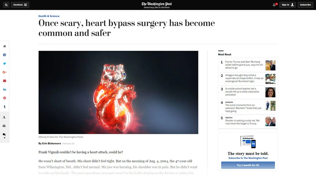
An ambitious format: 12 × 14 inches, as a section cover. Space reserved at the top for the “Health & Science” masthead. Floating heart. And above all: beautiful, not gory.
“This is going to look so different for my section!”
That kind of sentence at the start of a collaboration is both pressure and fuel.
The Concept: glass as metaphor
Glass imposed itself naturally. A glass heart is surgical precision made visible — you see inside, you understand the mechanism, without blood, without violence. It is fragile and solid at the same time, like an organ that gets repaired and keeps going for decades.
The client’s brief added an elegant constraint: keep the red, keep the pink. Not a neutral or metallic glass — a red glass, organic, alive.
Alla Dreyvitser had initially mentioned a light background — but it was ultimately a deep black background that was chosen for publication. A decision that changes everything: the red glass heart stands out like a precious object under a display case, almost mineral, suspended in the void.
The Technical Challenge: sculpture, double wall, refraction, liquid
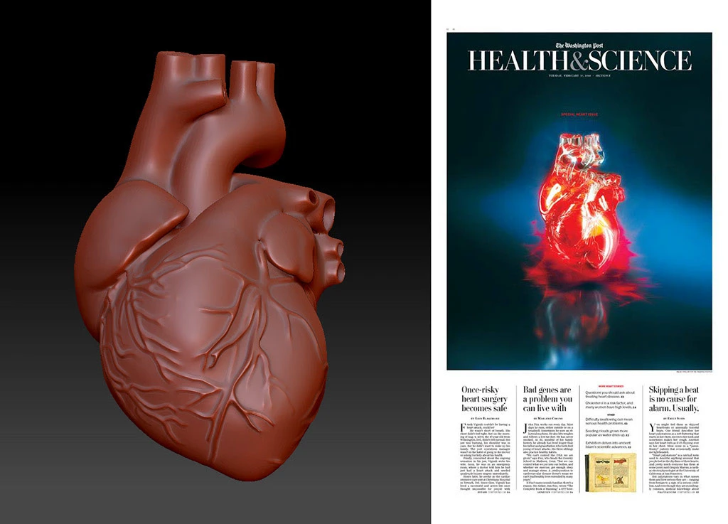
The full pipeline: ZBrush for sculpting the organic details — the veins, the surface irregularities that prevent the object from tipping into the artificial — then MODO for structural modeling and staging, and Octane Render for the shaders and lighting.
ZBrush is where the difference is made: without that sculpting work, the glass would have been perfect — therefore cold, therefore fake. The veins carved into the wall catch light differently, create depth, remind you that behind the object there is an actual organ.
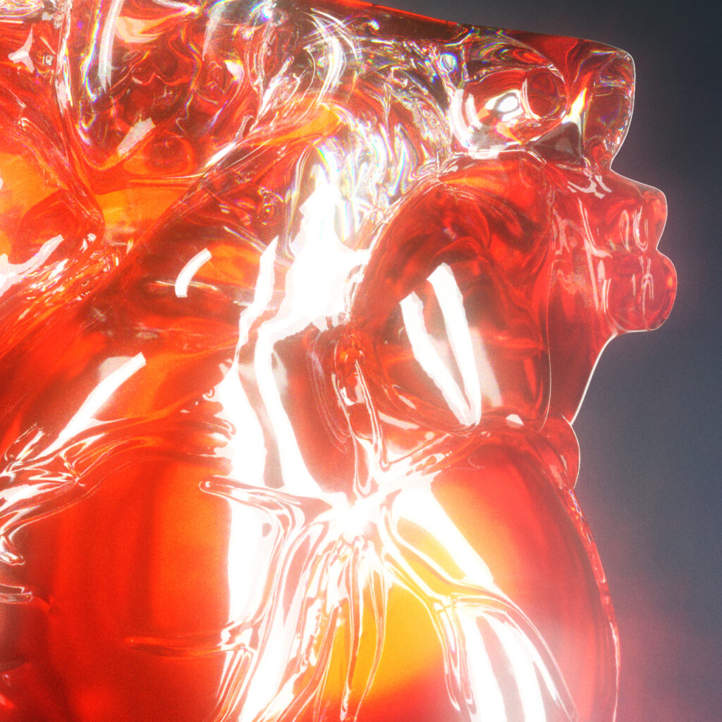
The shader solution: a double-wall glass — an outer transparent shell and an inner mass of red liquid. This approach makes it possible to play simultaneously with:
- the refraction of the glass (subtle distortion of light through the wall)
- the depth and translucency of the red liquid
- the reflections and caustics that give glass its precious character
It is this interplay between transparency, color and light that transforms an anatomical organ into something almost sculptural — immediately recognizable, but elevated.
The Result
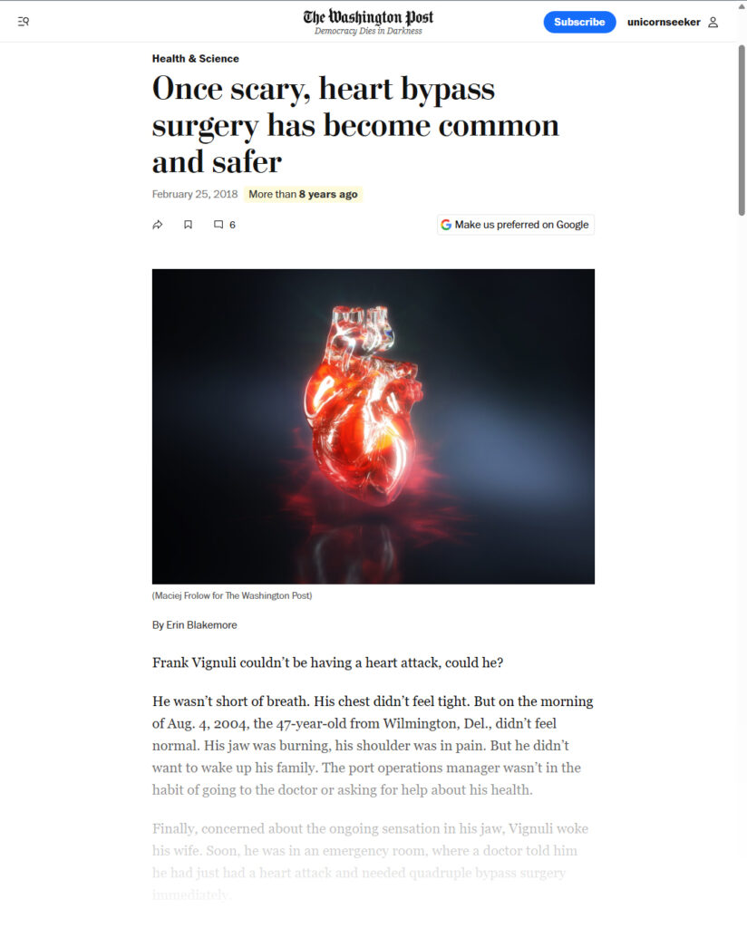
Three weeks of work. An image published on the cover of the Health & Science section of the Washington Post, in February 2018, accompanying articles including “Once scary, heart bypass surgery has become common and safer”.
A commission that perfectly illustrates what 3D can bring to editorial press: where photography cannot go, where 2D illustration would lack substance, 3D rendering creates something impossible — and perfectly readable.
Client : The Washingron Post
AD : Alla Dreyvitser
Agent : Richard Solomon Artist Representative