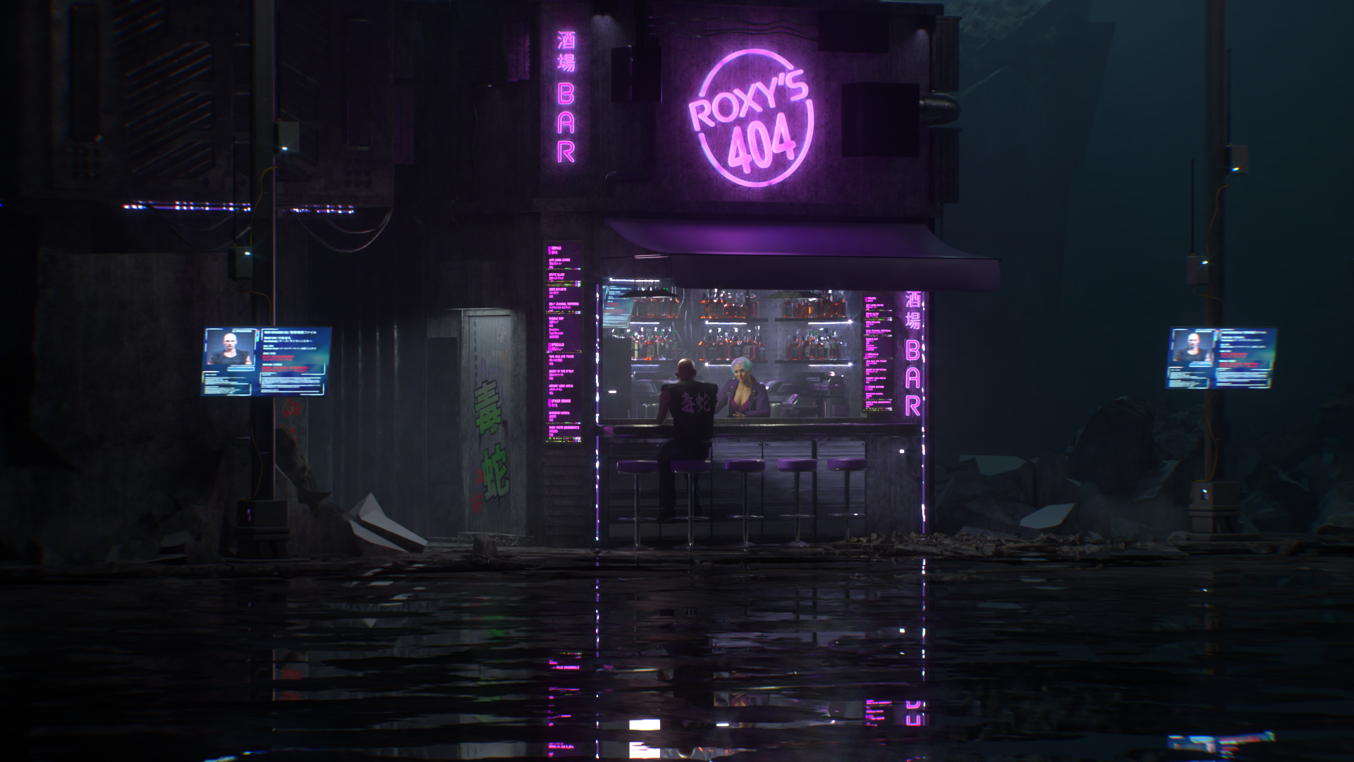
Victorian playing cards

The Victorian playing cards deck is composed of fifty two cards and two jokers. The project main idea is to replace the traditional court cards by symbols: scepter for the king, rose for the queen and pistol for the jack. Other cards stays as usual. The colors are copper for the red and silver for the blacks. The background is black with a victorian pattern. The cards are mirrored so they look the same upside down with subtile differences for the colors and textures.

The design is entirely modeled and rendered in 3D.

I invite you to support the kickstarter campaign that will fund the card printout.

3d design of playing cards

Campaign progress

Victorian playing cards -- Kicktraq Mini

Making of

26April2020

NIKE store concept

NIKE store concept for the Champs Elysees boutique in Paris
My work consisted in to creating 5 illustrations for the interiors, adding lights and liquid like screens. The last image show how the screen interacts with anyone who steps on it.

Agency : Les Grots Mots – Paris
Art directors : Gerald Schmite, Lucie Blanc Dumont
Tools : modo, zbrush, Octane, Photoshop

Big thanks to Jean Michel Mateo

27June2019

In Your Dreams

Personal project of a dreamlike scene with floating rocks, wtaerfalls and purple trees.
Rocks modeled in zbrush. Textured and rendered in modo + Octane. Touch-ups in Photoshop

Work in progress:

Rocks:

Those rocks are available for sale on CGTrader, you can use them in your architecture or landscape scenes. As they come as zbrush objects they are very detailed.

09January2019

The Real Deal Opportunity Zones magazine cover

For their Los Angeles magazine supplement Paul Dilaikan asked me to create an illustration with a title made of pushpins on a map. The assignment was not so simple as it sounds, the title has to be 100% readable so choosing the right ammount and size of the pushpins was the key. Plus an attractive color palette. We have finished with three color sets and one was choosed for the cover. Another one (the colorful) was used inside the magazine. here you have the final images and the variations as well as few close-ups.

The cover:

On the web:

The illustration alone:

Alternate versions:

Close-ups:

24October2018